Soft Autumn - A Seasonal Colour Palette and Cyclical Living in September
This blog is a series of blog posts writing about the 12 seasonal colour palettes that correspond to the months of the year.
I have collated everything I have learnt so far about seasonal colour palettes, seasonal personalities, colour psychology, cyclical living and seasonal living, with some added inspiration of the month.
You might discover your seasonal personality, your seasonal style, how to live cyclically by tracking the moon or your cycle, or you might just get some ideas and inspiration for the upcoming month.
“Autumn seemed to arrive suddenly that year. The morning of the first September was crisp and golden as an apple.”
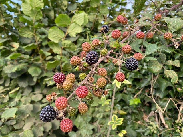
Cyclical Living in September
Hazy mornings, the end of harvest and an abundance of food and colour in the garden… It must be the start of autumn!
Soft Autumn is a seasonal colour palette that relates to the month September, the waning gibbous moon, late afternoons and the luteal phase of the menstrual cycle.
Cyclically, this is a time of gaining energy after the relaxing summer months but also preparing for rest in the winter months. We have an urge to complete the most important tasks that we started in spring. We have the ability to focus, a need to understand, a caring attitude and a desire to grow.
When we think of September we think of going back to school which gives some of us that new year feel. There’s the harvest festival with an abundance of food and the wildlife are busy preparing for winter. If September could have a slogan it’d be Gentle Busyness, following the calm summer and moving into an energetic season.
“The more that you read, the more things you will know. The more that you learn, the more places you’ll go.”
CYCLICAL Action NOTES for September
Declutter and let go
Gentle busyness
Small tasks, ticking things off the to do list and completing projects
Getting into a routine again
Preparing for winter
Reaping the rewards from spring and summer and practising gratitude
Get curious, focus, learn and grow
THE Soft Autumn Personality Type
The Soft Autumn personality type is an autumn personality which is influenced by summer. Like the colour palette, they are warm, soft, informal and gentle. Not as bossy or stubborn as the later autumn types but Soft Autumns still have a love for nature and all things cosy and relaxing. Summer contributes a sense of order, calm and organisation to Soft Autumn.
Soft Autumns are campaigners, justice seekers and approachable listeners with a desire to understand people.
Borrowed from summer, this personality also gains attributes such as efficiency, productivity and a calm nature. Soft Autumns are collectors of things, researchers, bookworms and curious fellows. Their home is full of “organised chaos”. Informal and relaxed is how they like it best.
“Some people talk to animals. Not many listen though. That’s the problem.”
Soft Autumn Colours & Style
Soft Autumn is predominantly muted (or soft), the palette is mostly warm, and is both light and dark. The colours have very low contrast (the lowest of all 12 seasons along with Soft Summer). It is the most muted palette of the 12 seasons with the lowest tolerance for bright colours.
Think of harvest fields, going back to school, all things natural and ancient, books and an abundance of food.
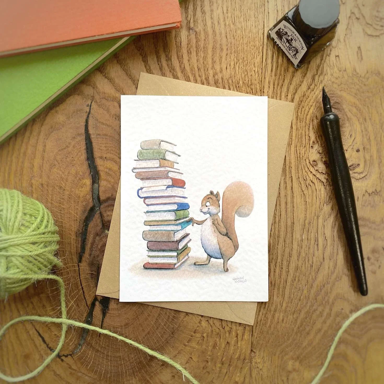
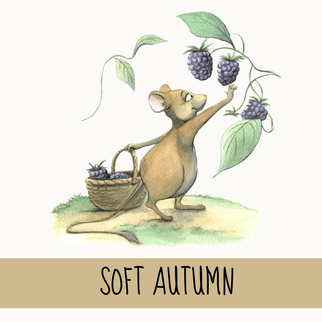
Illustration using a soft autumn colour palette - available as a card, bookmark or print from my shop.
Soft Autumn style Keywords
Soft / muted
Warm
Light and dark
Natural
Low contrast
Gentle
Subtle
Desaturated
Informal
Relaxed
Environment
Earthy
Delicate
Blended
Intricate nuances
Abundance
Harvest fields
The Colour Palette of Soft Autumn
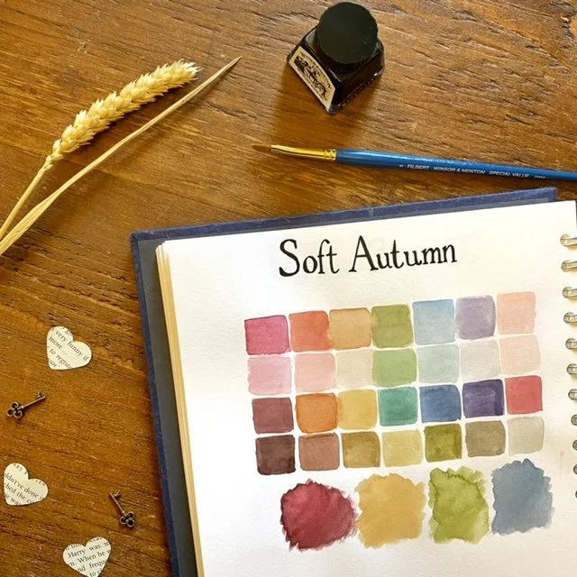
Soft Autumn colours are predominantly muted which means each colour has been mixed with their complementary colour (red is mixed with a little green which creates a muted, brown-red). This softness gives the palette its earthy, natural and approachable feel.
The palette is mostly warm so the colours are all yellow-based - there are lots of reds, oranges, yellows, warm neutrals and browns. Green is on the yellow side, blue is on the green side giving mint and teal, and the pinks are on the red-orange side appearing more like a peach hue. There are also warmer greys like green-grey.
As the contrast is so low in this palette, the colour combinations need to be blended and harmonious. Some combinations to try:
Mix versions of the same hue but different value (light and dark green);
Try a harmonious blend of neighbouring hues but the same value (dark red and dark orange);
Mix a neutral with a similar accent colour (mid-brown and mid-red).
Colour Psychology of Soft Autumn’s Top Colours
Here’s a list of Soft Autumn’s top colours and what each different shade says using colour psychology:
Red - deep, muted, terracotta - campaigner, passion, justice, rebellion
Orange - neutral and peach - approachable, warm, friendly conversation
Yellow - pale sand and ochre - a gentle energy, slight confidence
Green - fern - reassurance, boredom, balance
Turquoise - mint and teal - uplifting, inspiring
Blue - deep purple/grey- blue - serenity, boost of concentration
Purple - blue-purple - integrity, truth
Pink - peachy pinks - nurture, care
Neutrals - red-browns, yellow-browns and green-browns - approachable, dependable, relaxed, supportive, patient, solid
Grey - warm pale and dark greys - quiet, uneventful
Patterns, Shapes & Style
Patterns should have harmonious blends and no contrasts. Go for neutral shades over bright, saturated colours.
Avoid geometric shapes, modern styles, minimalism and order - Soft Autumn is all about feeling informal, relaxed and cosy with a sense of abundance. Use texture to create intricate nuances, random collections of things and natural elements.
Soft Autumn’s shapes are ovals and leaf shapes.
A list of elements to include: anything natural, wooden, leaves, wheat, floral, antiques, books, feathers, baskets, clocks, twine, texture and linen.
The best fonts for Soft Autumn are typewriter, a handwritten serif, cursive or western.
Using Soft Autumn in the Home
The best rooms in the house to use a Soft Autumn colour palette are the kitchen, dining room, lounge, bedroom and nursery.
Because Soft Autumn has a big association with food and the top colours are warm hues like reds and yellows, the kitchen and dining room are perfect for a relaxed and informal, appetite-boosting space.
The palette is calming and full of care and nurture, so the bedrooms and nursery also work well with this colour palette. Avoid using too much yellow or dark brown in the nursery, though, as these are unsettling.
This palette works creates a cosy, relaxed and informal environment full of stability and warmth, making it perfect for a lounge if you prefer softer and muted shades over impact.
Rooms to avoid using a Soft Autumn colour palette: bathroom (not refreshing enough), gym (not motivating enough), a study (not enough blues or brights).