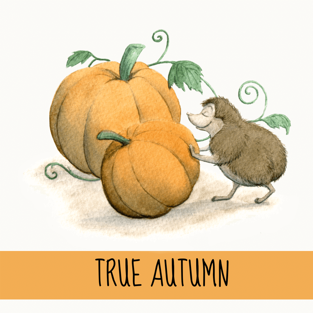
True Autumn - A Seasonal Colour Palette and Cyclical Living in October
This blog is a series of blog posts writing about the 12 seasonal colour palettes that correspond to the months of the year.
I have collated everything I have learnt so far about seasonal colour palettes, seasonal personalities, colour psychology, cyclical living and seasonal living, with some added inspiration of the month.
You might discover your seasonal personality, your seasonal style, how to live cyclically by tracking the moon or your cycle, or you might just get some ideas and inspiration for the upcoming month.
“I’m so glad I live in a world where there are Octobers.”
Cyclical Living in October
The heart of autumn is here and it’s time to settle down and embrace all things cosy. If there was one month to represent the Danish word, Hygge, it’d be October. October’s theme is an informal one of relaxing and getting warm by the fireplace; it’s a time for knitwear and wellies, hot drinks and hearty dinners.
True Autumn is a seasonal colour palette that relates to the month October, the last quarter moon, dusk and the luteal phase of the menstrual cycle.
Cyclically, it feels like there’s a lot of nesting energy going on although our energy is actually turning inwards at this point. There’s even more of an urge to complete unfinished projects and goals. We want to get into study and research mode in a season that represents history, nostalgia and details.
There are two social sides to True Autumn: the introverted, independent type and the friendly, caring type who loves to talk deep into the night with a small group of close friends.
““I don’t feel very much like Pooh today,” said Pooh.
“There there,” said Piglet. “I’ll bring you tea and honey until you do.””
cyclical action notes for october
Declutter and complete unfinished projects
Focus, learn and grow
Get inquisitive, study and dive deep into research
A time for abundance and collections
Create things of substance
Embrace your stability and strength
Gain independence but remain part of a small community
Relaxed and cosy work by the fireplace
The True Autumn Personality Type
The True Autumn personality type is autumn in all its glory. True Autumn types are most likely to be found in a dusty old secondhand book shop or sitting around a cosy fireplace in a deep discussion with very close friends. Like the colour palette, True Autumns are warm, fiery and strong.
The previous season, Soft Autumn, represents a caring, approachable and friendly personality, whereas Dark Autumns are rebellious, confrontational and stubborn. True Autumn sits in between the two and this personality type is a blend of these qualities: warm, passionate, focussed and ambitious.
There’s a love for nostalgia and anything rustic and old. True Autumns are history lovers, researchers, antique collectors and intellectuals with a strong work ethic. They are reliable, strong and dependable friends who value time alone as well as being part of a small community.
True Autumn Colours & Style
True Autumn is predominantly warm, secondarily muted (or soft), and is slightly more dark colours than light. The palette has a medium contrast and medium saturation. Along with True Spring, it is the warmest colour palette of the 12 seasons.
Think of glorious orange sunsets, forest walks at dusk, golden leaves crunching under your feet, and a cosy living room full of antiques, cobwebs and trinkets.
True Autumn is the most earthy colour palette and values details, texture and the countryside.
True Autumn Style Keywords
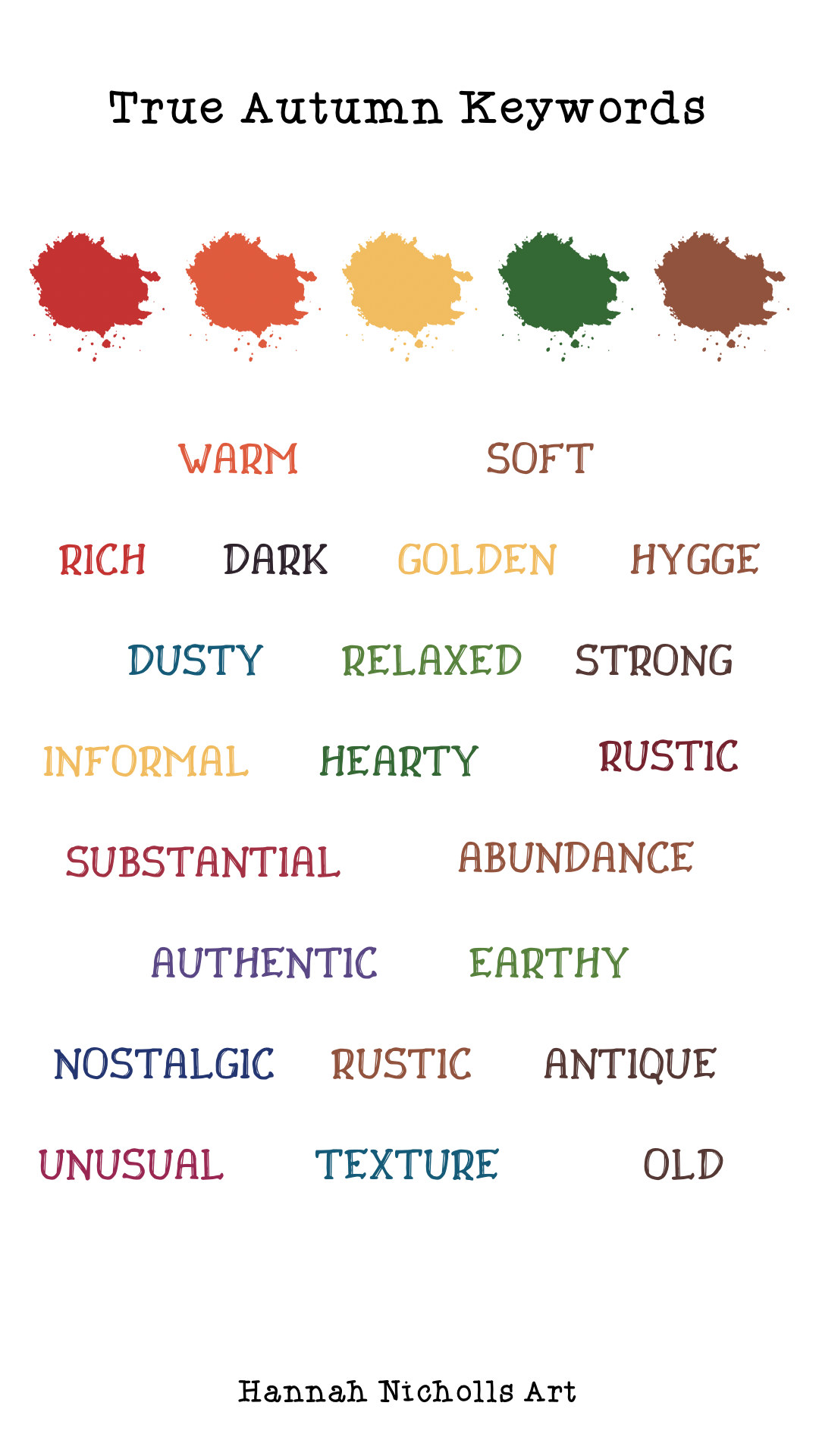
Warm
Soft (or muted)
Dark
Earthy
Intense
Rich
Golden
Country
Substantial
Relaxed
Texture
Vibrant
Yellow-based
Old
Antique
Abundance
History
The Colour Palette of True Autumn
True Autumn colours are predominantly warm which means most of the palette is yellow-based (yellow being the warmest colour). The warmth gives the palette a sense of enthusiasm and a burst of energy.
The palette is mostly muted so the colours have been mixed with their complementary to create less vivid hues. However, the colours still appear very rich and intense but this is because warmer colours tend to stand out more - our eyes are drawn to these colours. The warmth makes the colours appear more saturated but the saturation is actually fairly medium.
The contrast level in this palette is medium (higher than the previous palette of Soft Autumn).
Some combinations to try:
Mix versions of the same hue but with a high value contrast (eg. light and dark green);
Try a harmonious blend of neighbouring hues with a similar value contrast (eg. medium red and dark orange);
Mix a neutral with a similar accent colour and a high value contrast (eg. light beige and dark-orange).
Colour Psychology of True Autumn’s Top Colours
Here’s a list of True Autumn’s top colours and what each different shade says using colour psychology:
Red - rich orange-red - courage, energy, abundance, fiery, rebellious
Orange - deep, rich orange - unrefined, energy, productive
Yellow - golden yellow - a small community, confidence, inquisitive, enthusiasm
Green - yellow-based olive green - reassurance, old
Turquoise - medium to dark emerald - balance
Teal - rich, saturated teal - authentic, original
Blue - navy blue - strong work ethic, trust, serious, focus, aloof
Purple - rich, fuchsia purple - royalty, power, strength, energy
Pink - deep wine pink - passionate, compassion, feisty spirit
Browns - terracotta mid-browns - dependable, cosy, lack sophistication
Ochre - irritation, warmth, confidence
Light neutrals - warm and pale neutrals - earthy, history, supportive
Dark neutral - brown-black - bossy, commanding, substantial, stubborn, unyielding
Patterns, Shapes & Style
Patterns should have natural blends with some contrasts. Go for a balance of dark, light and muted shades.
Avoid symmetry, modern styles, minimalism and order - True Autumn is all about the relaxed, natural, wonky and the unusual shapes and styles. Also avoid spring like ditsy patterns and small elements. Use texture to create interest, gather random collections of historic things and use natural elements like wood and leaves.
True Autumn’s shapes are irregular, hexagonal, pentagons and leaf shapes.
A list of elements to include: conkers, oak leaves, twine, cobwebs, hot tea, antiques, old bricks, mushrooms, dusty books, knitwear, ink pots, quill, stained paper and stamps.
The best fonts for True Autumn are typewriter, brush pen, stencil and slab serif.
Using True Autumn in the Home
The best rooms in the house to use a True Autumn colour palette are the kitchen, dining room and lounge,
Because True Autumn has a big association with hearty food and the top colours are warm hues like reds and yellows, the kitchen and dining room are perfect for a relaxed and informal, appetite-boosting space. Expect good conversation and interesting debates.
The warm element definitely works well for a snug and cosy lounge - especially for a lounge with a brick fireplace and a wood floor.
For the academics and history buffs, True Autumn offers a classic looking study full of trinkets and dusty old books. However, for the creative, fresh-thinking types, this palette wouldn’t work for your place of work at all - it would feel uninspiring, old and almost claustrophobic.
This palette is a little too dark and unyielding for a bedroom or nursery; there are too many rich yellows and browns and not enough blues (proven to be the best colour for a good night’s sleep).
Rooms to avoid using a True Autumn colour palette: bathroom (not refreshing enough), gym (not motivating enough), a study for creatives, bedrooms and nursery.